New visual identity for the City Council
Thu, 16/10/2025 - 08:53
Graphic identity. The new communication signature aims to strengthen the city’s identity and the connection with citizens.
The aim is to put the city in the centre, with a change that modernises and simplifies communication from the City Council.
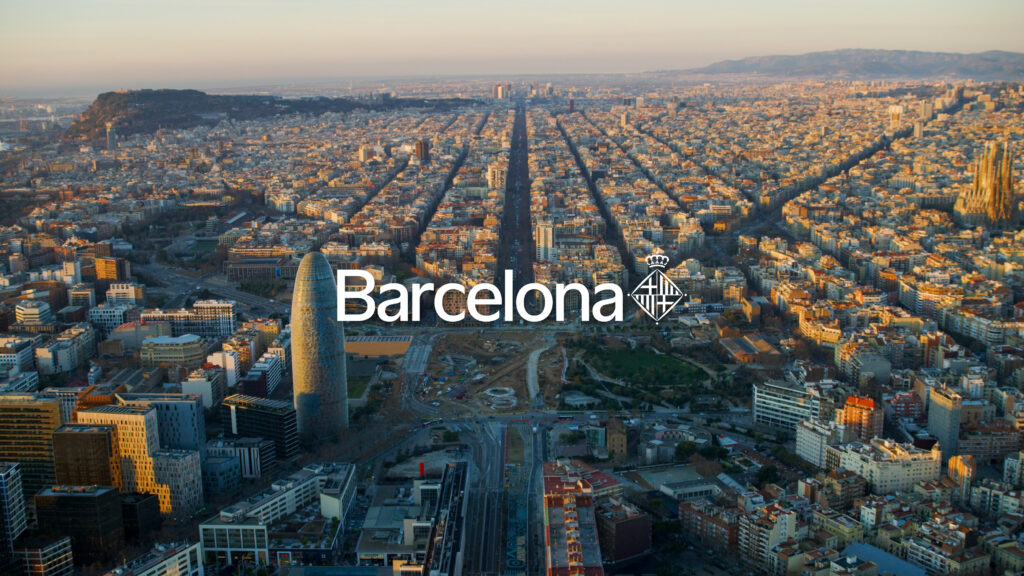
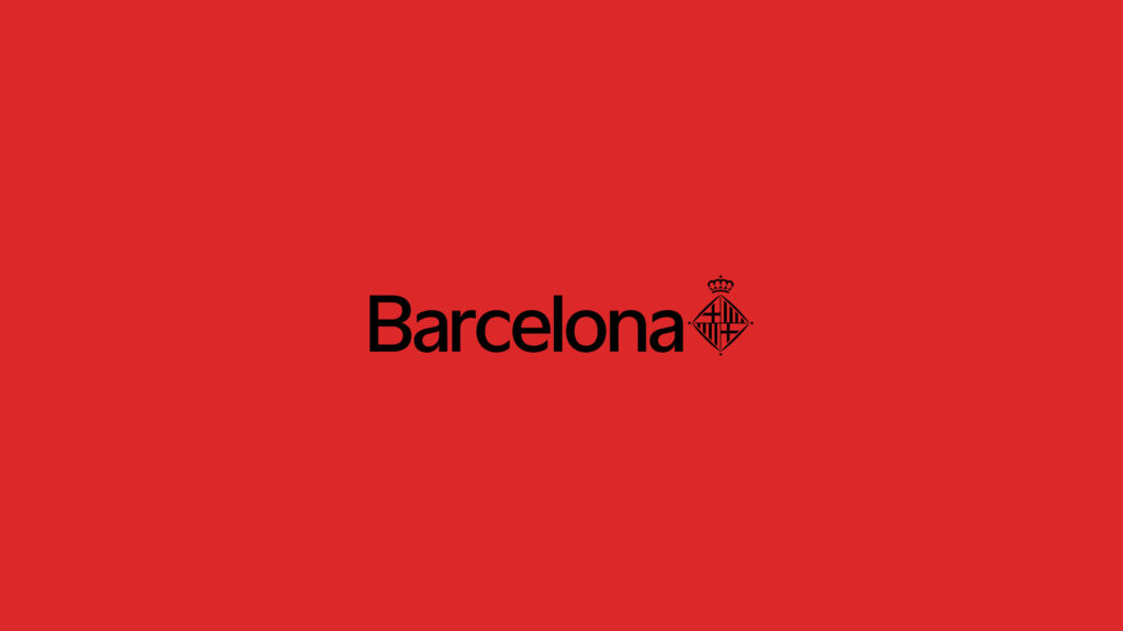
The new logo simply indicates the word ‘Barcelona’, accompanied by the official shield, showing the connection between the institution and the city with a more current and versatile visual system.
The goal is to improve comprehension and reduce the visual noise of municipal communication, particularly in digital channels and small formats, where the previous version was difficult to read in some cases. The city’s graphic identity had not been changed for fifteen years. With the new image there will be a single logo, facilitating identification, strengthening the brand and avoiding confusion. The unification of formats and applications also seeks to optimise work processes.
The project was designed by the Principi studio, winner of the competition launched by the Association of Graphic Design and Visual Communication (ADG-FAD).
Barcelona font
The new signature maintains its colour gamut and makes it accessible in digital formats, also incorporating Barcelona’s own font. This unique and more familiar font features rounded letters and organic details that evoke the calligraphic legacy and break away from rigidity to foster warmer and friendlier communication.
The new communication signature can be found at: barcelona.cat/normativagrafica. Given the large volume of spaces where it will need to be changed, this will be a gradual process.